How to create a horizontal line in a column graph.
This is actually one of the most common questions I get. The following is for a column graph, though you could apply the principles to many different types of graphs. Excel 2007 was used in this example, though the process should be similar for 2010 and 2013 as well.
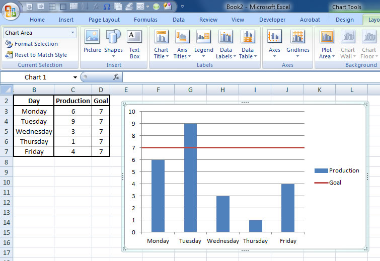
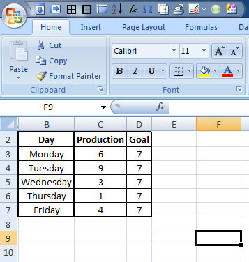
1. First, set up your data with your x-values on the left, then your y-values in the middle, then repeat what you want your horizontal line to be for each line on the right. Put labels at the top.
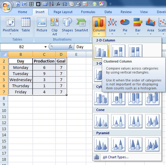
2. Highlight the data, including the labels, and select a column chart.
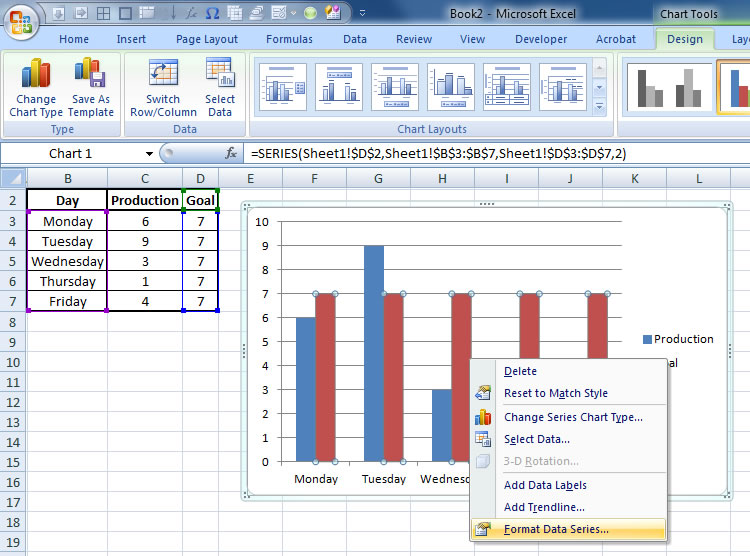
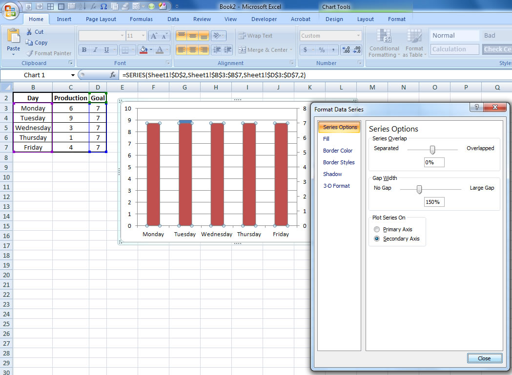
3. Click on the data that you want to turn into a line, then right click it and select “Format Data Series.”
4. Choose the “Secondary Axis” option and close the window.
5. Click on the data that you want to turn into a line, then right click it and select “Change Series Chart Type.”
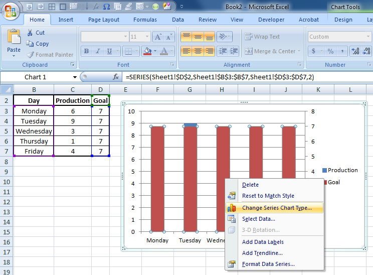
6. Choose the “Scatter with Straight Lines” option and hit “Ok.”

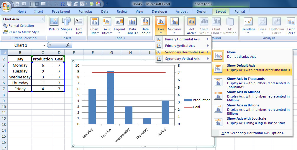
7. While you have the chart selected, go to the “Layout” tab under “Chart Tools.” Under “Axes,” go to “Secondary Horizontal Axis” and select the “Show Default Axis” option.
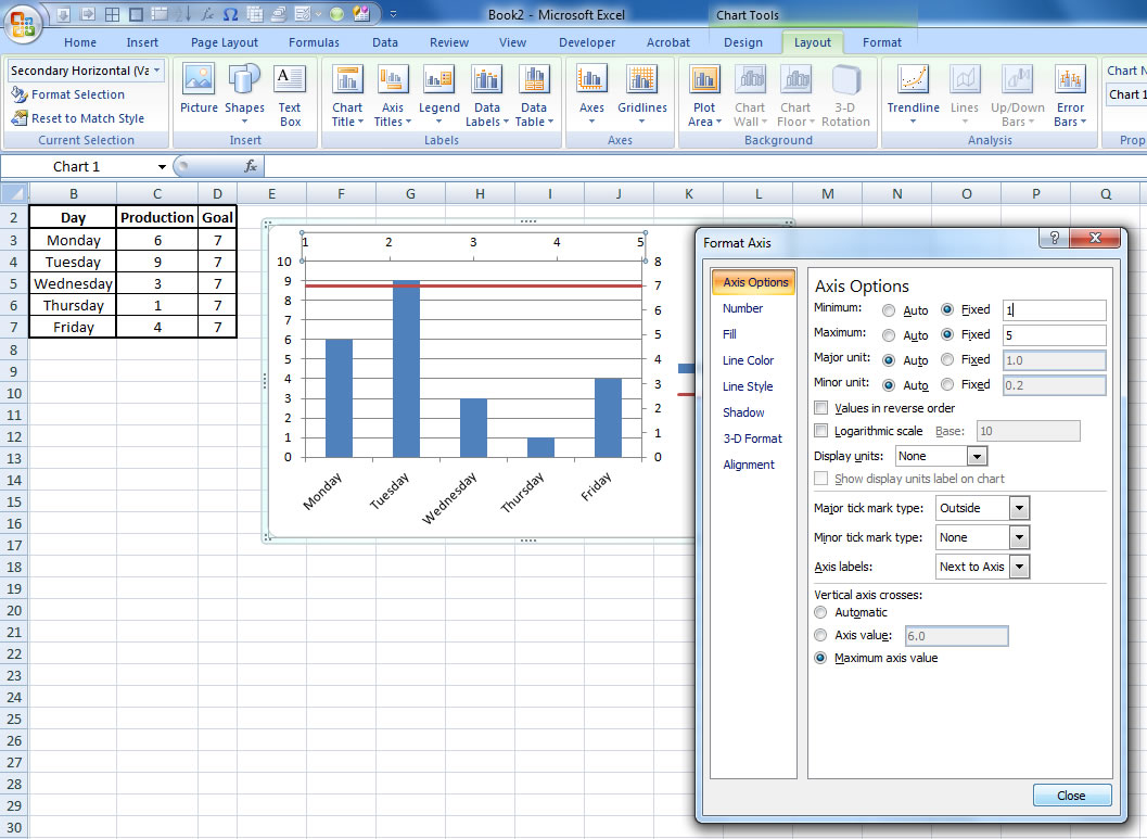
8. Click on the horizontal axis at the top of the chart, then right click it and select, “Format Axis.”

9. Under “Axis Options,” change the minimum value to a fixed value of 1 and the maximum value to a fixed value equal to the number of observations you have. (If your x values are numerical, use your maximum x value here).
10. Select the top horizontal axis and delete it. Then select the right vertical axis and delete it as well.